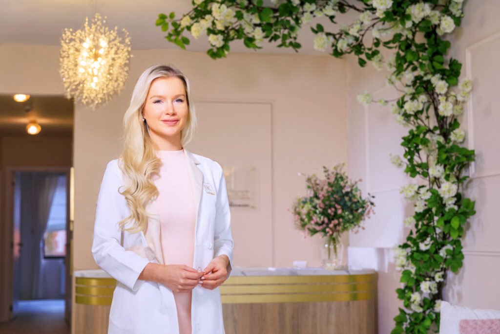
Finally, I can show you, with quite some pride, what Doctor Contour Clinic, the new medical aesthetic clinic in Antwerp, Belgium, looks like! As I mentioned in my previous post, I ultimately decided to take on the rather daunting task of designing and organizing it myself. After a lot of blood, sweat, and tears, and many moments where I thought ‘Why did I really take on this task myself?’ to ‘This is really tough. I’m exhausted…’ to ‘What have I started?’, I am ultimately really happy with the final result!
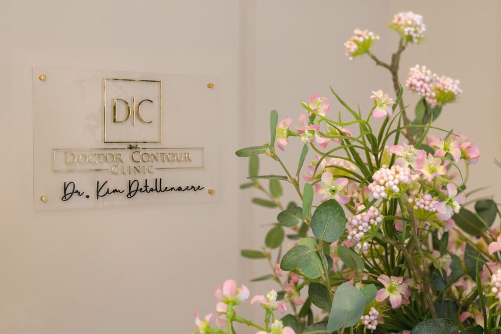
Many doctors who start a project like this hire an interior designer, and when I saw with my own eyes how challenging this process was, I truly understood it… Yet, I am ultimately very pleased that I persevered and managed to make Doctor Contour Clinic a place that fully radiates the energy, atmosphere, and aesthetics as I perfectly want, and no one else could have created this.
Since I had so little knowledge nor experience regarding interior and design, I had to learn a lot in a short time to make something out of nothing. Therefore, I thought it would be nice, in addition to showing the final result, to give some more info about why I chose certain elements in the interior, as a lot of thought, planning, and considerations have been taken into account. You can watch the video at the bottom, but I have also ‘briefly’ summarized everything below.
The Main Themes and Accents in the Interior
Flowers
If you’ve been following me on my personal Instagram for a while, especially my spring photoshoots from the past years, you’ll have noticed that I take a lot of pictures in flower fields. Think of the photoshoots I’ve done in the Hallerbos with the bluebells, the tulip fields, and the white and pink spring blossoms.

I have always been a fan of an aesthetic with flowers and believe that flowers give a soft, feminine atmosphere to an interior. Flowers also have a enchanting appearance, and I wanted patients to be able to relax for a moment when they enter my clinic, due to the environment. For some patients, injections are not something they look forward to, and I hope that the enchanting environment can help them find some peace.

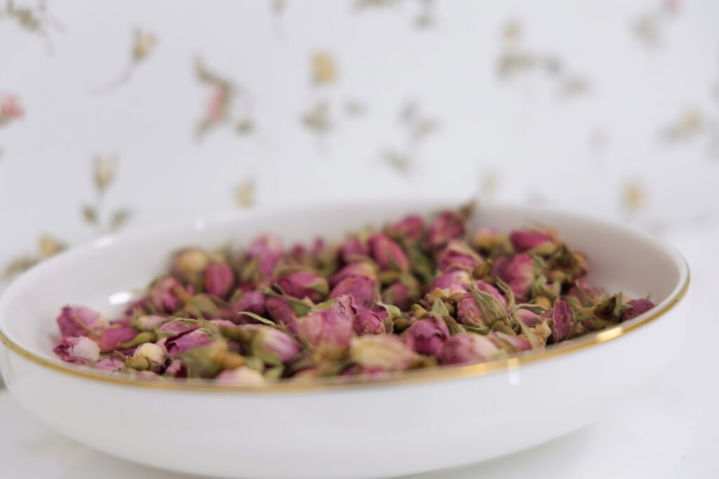
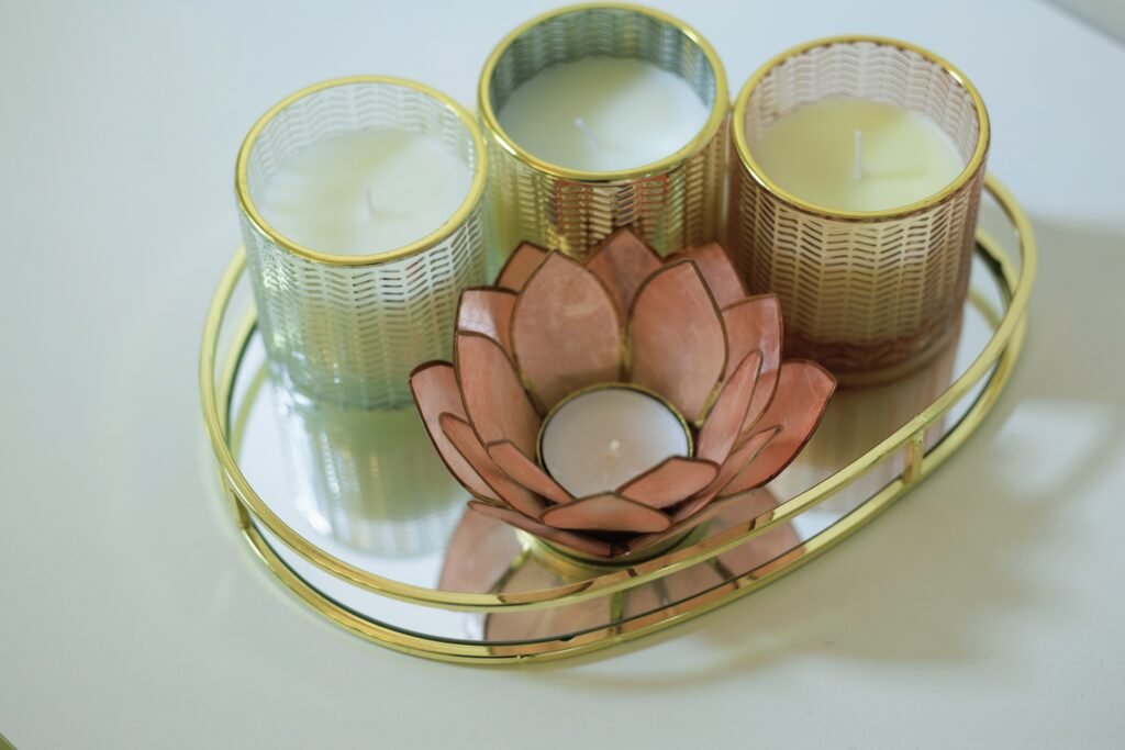
Finally, a flower symbolizes for me the unique and individual beauty. Flowers come in many shapes and sizes, and even though I use objective and universal measurements (such as the golden ratio) to make my patients look naturally more radiant, I will always respect the unique and individual beauty and the aspects that make a face unique. I definitely don’t want to create hundreds of Kylie Jenners and Kardashians (and oh no, this is certainly not my vision of aesthetics!), but to make people feel more radiant in a balanced and harmonious way without removing the unique features of the face, because beauty can – despite universal mathematical lines and proportions – still occur in many different forms.
Golden Accents
Since the rebranding of my blog to ‘Doctor Contour’ aesthetic guide, I have chosen gold as my logo. I continued this theme into the clinic section, which is why I chose to integrate these golden elements into as many interior details as possible. Why gold? The color gold is often associated with luxury, exclusivity, and quality. Additionally, gold can also create a sense of warmth and make you feel welcome.
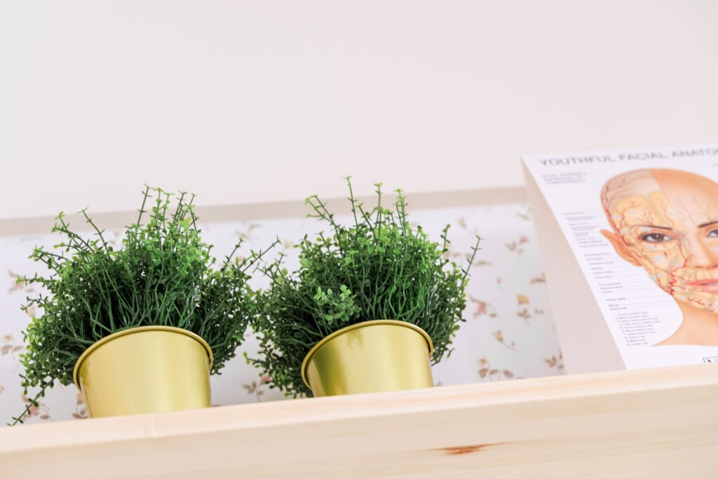
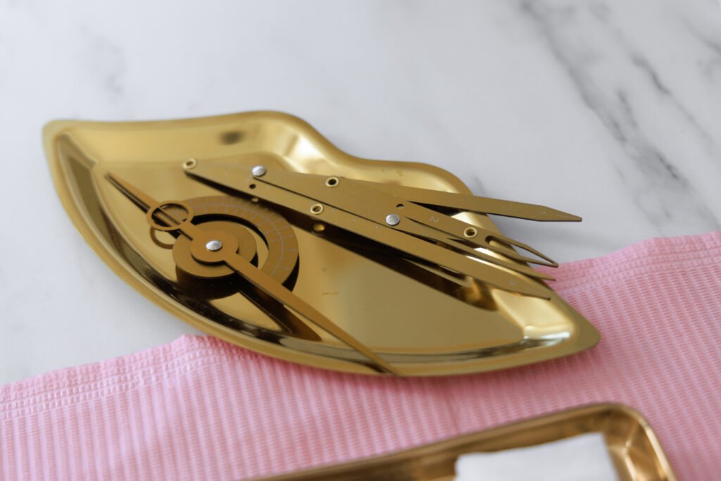
When I began designing Doctor Contour Clinic, it was my plan to make it an aesthetic clinic offering premium service to patients.
What does this mean?
As an aesthetic doctor, my goal is to spend a lot of time with patients through a very comprehensive consultation to assess their wishes, counter any concerns, provide sufficient information, and, last but not least, conduct a thorough analysis of the face (or possibly other parts like the décolletage, neck, or hands, for example) to propose a personalized treatment.

I definitely didn’t want to create a clinic where people are just a number in a long list of patients, where each patient is scheduled for a maximum of fifteen minutes, where consultations have to be rushed, and where you’re out the door as quickly as possible.
Beige Shades with a Touch of Pink
Just like gold, beige shades can radiate a sense of warmth and welcome. Additionally, beige shades can create a calming environment with a soothing effect, which is essential for patients who may be nervous about their treatment. But what I learned while choosing the type of beige was that beige always comes with a certain undertone, which can be greenish, yellowish, orangish, or pink. Apparently, there was no beige that was completely ‘neutral’. In hindsight, I don’t know why it took so long to make a decision, because the pinkish beige is and remains the most ideal in my case.
Although… My main hesitation was because I wanted to give my interior a somewhat soft, feminine touch, but at the same time, I didn’t want to deter any male patients, so I didn’t want to make it too feminine either. Is the interior too feminine for potential male patients? What do you think?
Additionally, a few purely light pink shades can be noticed in a few small details: cushions, a throw for the couch, the flowers on the reception desk, and all medical tools such as latex gloves, face masks, etc., have also been chosen in pink. Well, you have to stay true to your feminine nature, after all.
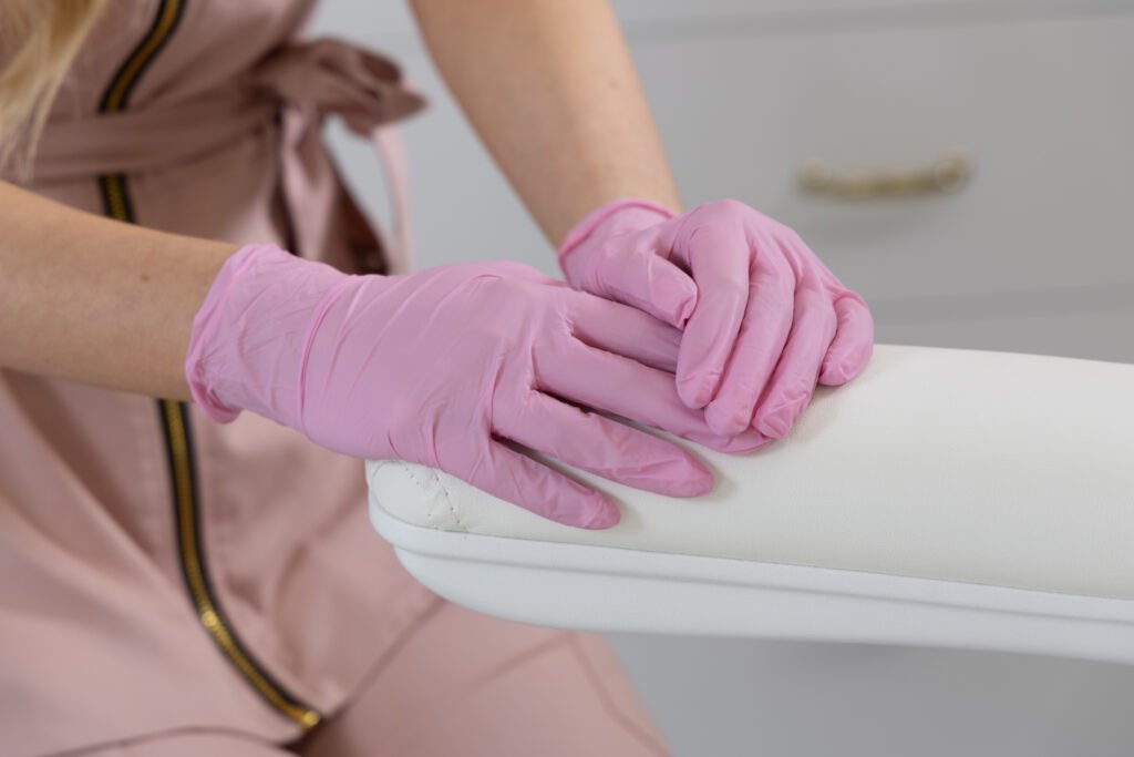

The alternative was to choose a completely ‘gender-neutral’ interior to appeal to as broad an audience as possible, but I had to follow my hyper-feminine personality in these elements.
Marble
A touch of ‘marble look’ can be found in the clinic, as marble always adds a more luxurious touch to an interior. This is mainly dominated by the floor, but we also find this in, for example, the countertop of the cabinets in the treatment room or on the reception desk itself. Since the floor itself is already quite dominant, I definitely did not want to add more marble details.

Discussion of All the Different Spaces/Sections
1. Reception Area/Waiting Room
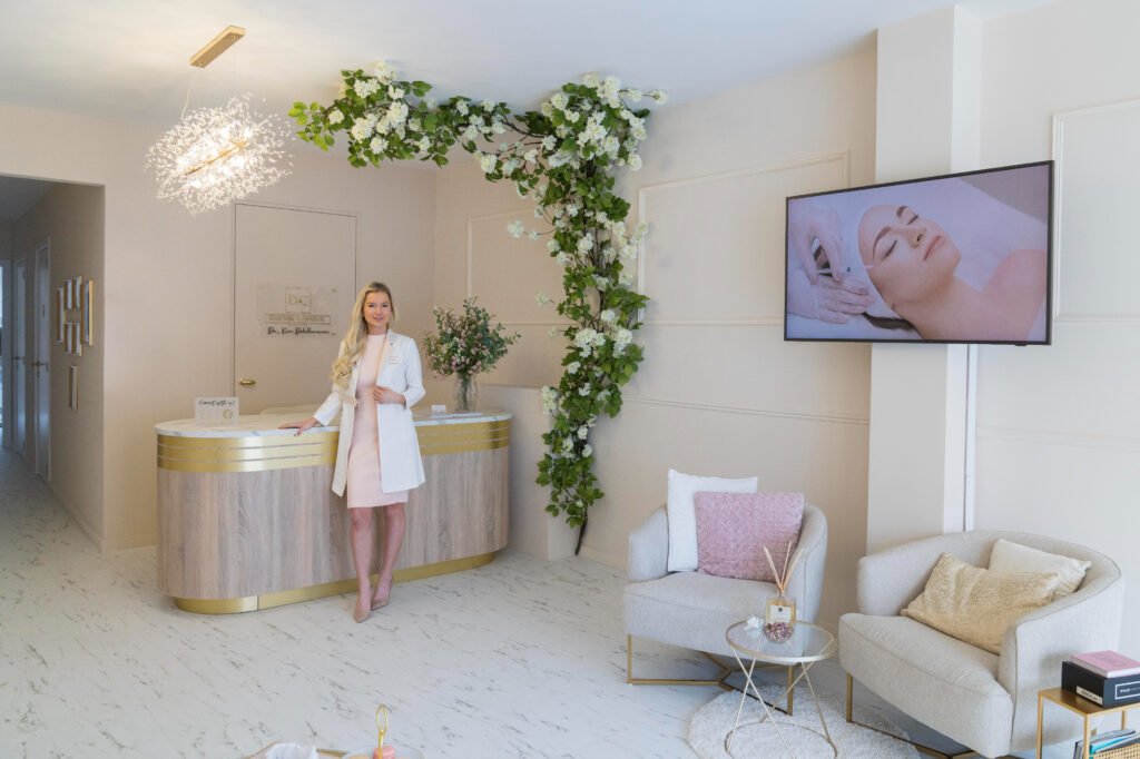
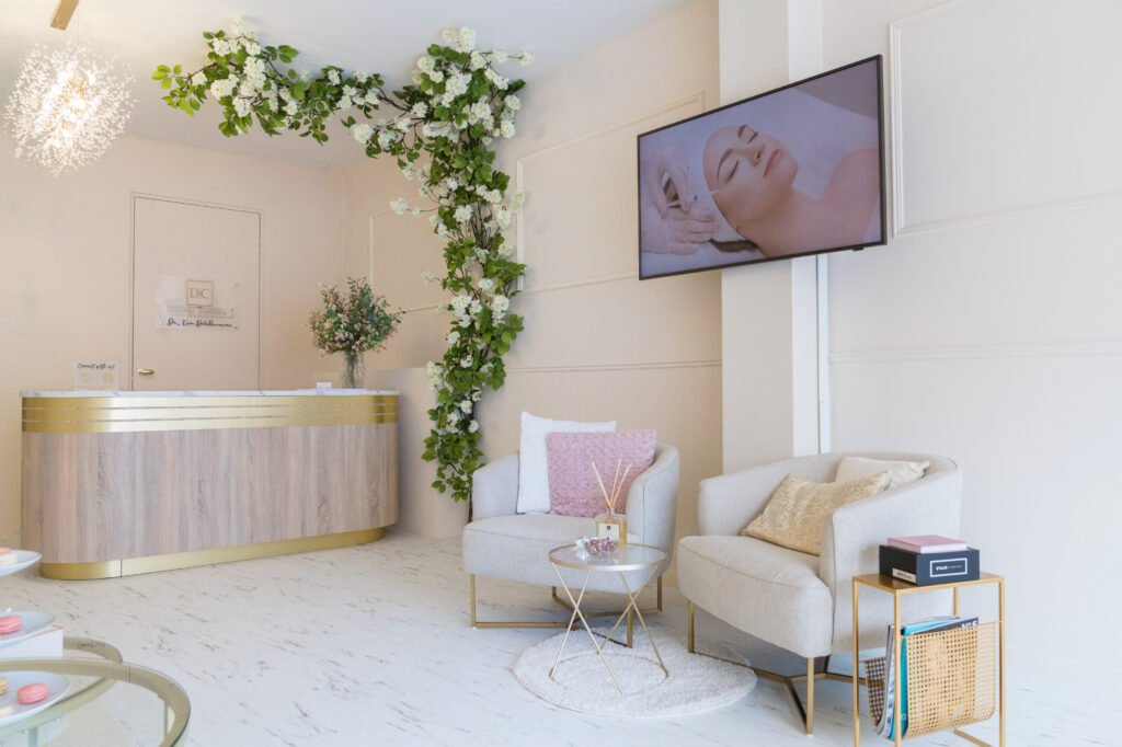
The reception area/waiting room was initially the most difficult space for me to furnish. Not only was the reception area a fairly large space to decorate, but a reception area is also the most important space when it comes to decor. Many people find it quite logical for a treatment room to be decorated in a ‘simple’ and ‘clinical’ manner, but a reception area is the first room people enter, and it must immediately reflect the ‘brand’ and instantly create an atmosphere where the patient feels comfortable and at ease. As mentioned earlier, a certain percentage of patients are a bit nervous about a consultation and treatment, and it’s important that people feel somewhat calmer as they wait for their appointment.
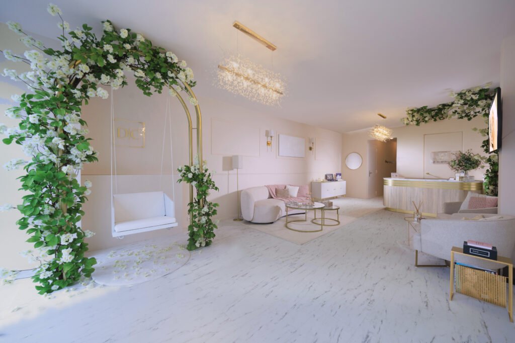
In fact, the ‘Instagram photo spot’ is in the same space as the reception area and is essentially part of this area. However, I will only discuss this in point 3.

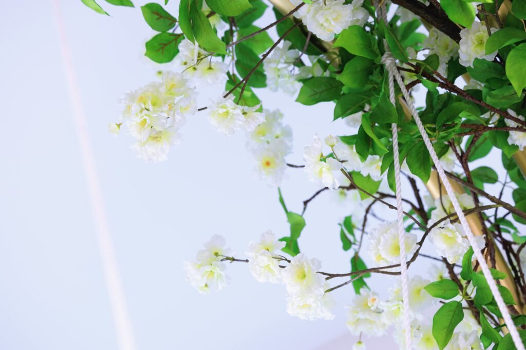
I wanted to give the reception area a somewhat enchanting atmosphere, so that you feel like you’re in another world and can thus forget about everything a bit and relax. I found the use of flower decorations perfect for this! I chose these white spring blossom-like flowers since white is still a fairly neutral color that matches best with the pinkish beige wall.
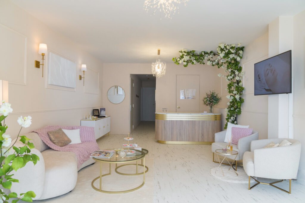
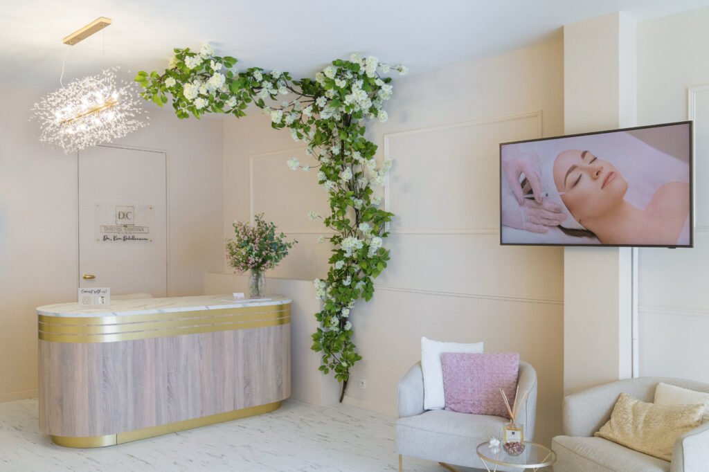
The reception desk is made of oak wood with a small golden detail. This is the only element in my interior that is made of wood, but I found it perfect for a reception desk as wood makes the environment warmer and more welcoming, which is important for a reception area.
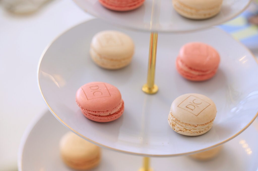

Macaron cookies with the Doctor Contour logo.
2. Treatment and Consultation Room 1
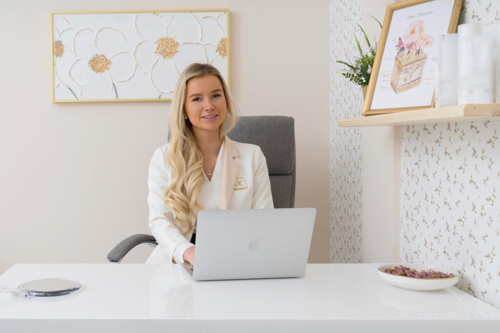
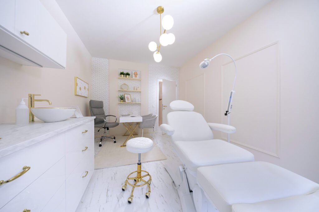
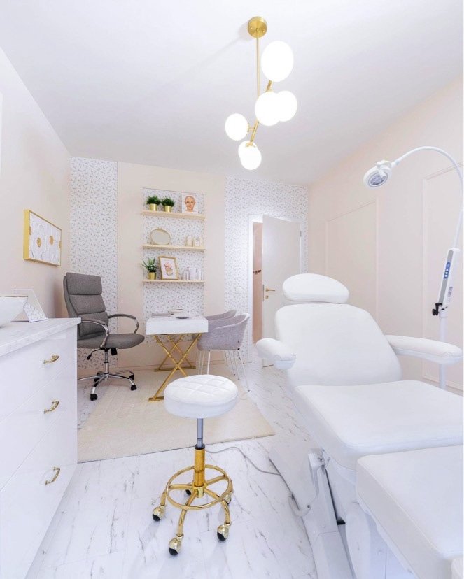
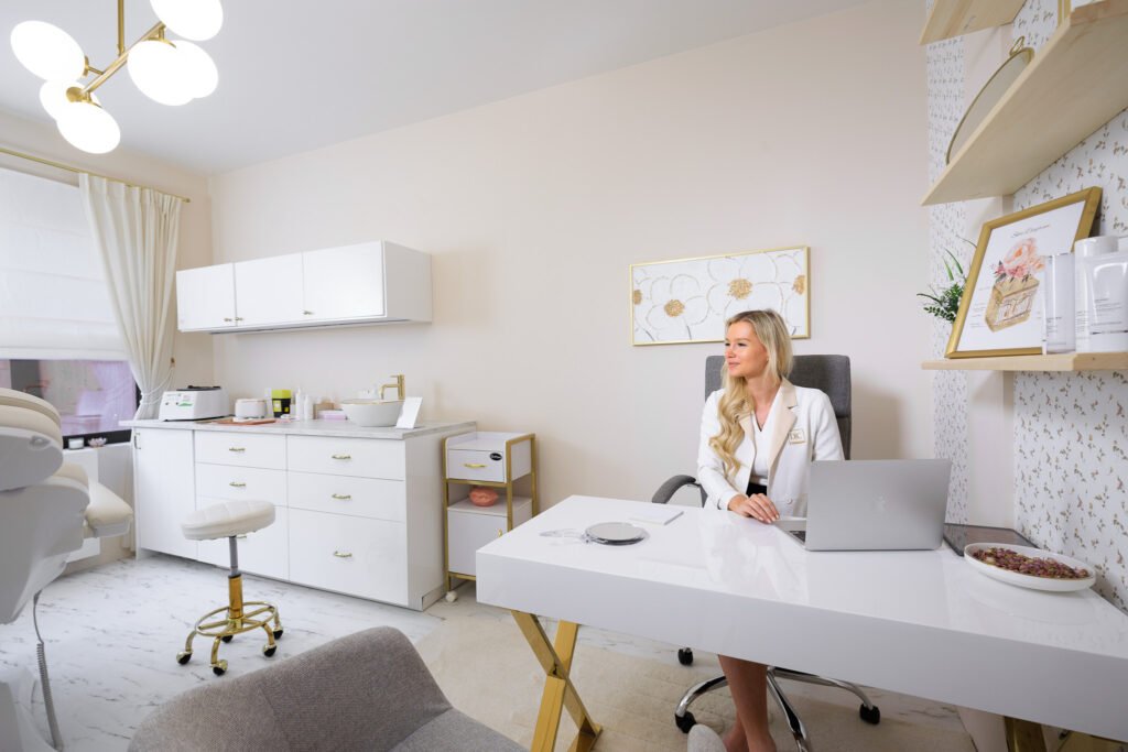
Let’s take a look at the first treatment room of Doctor Contour Clinic. The clinic has the potential for multiple treatment rooms, but I chose to start with one and will definitely take at least a second treatment room into use as the clinic grows. The treatment room itself is not very large, but a lot of space is not needed to conduct a good consultation and carry out a treatment. Here too, you see the light pinkish beige color on the walls, and one wall is wallpapered with subtle floral wallpaper. For the rest, you see the same themes recurring: golden accents, floral accents, marble look on the floor, and on the countertop of the cabinets.

3. Instagram Photo Spot
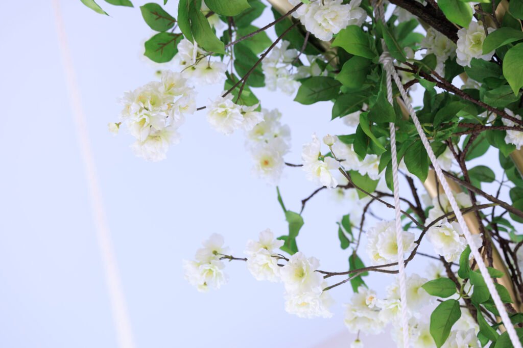
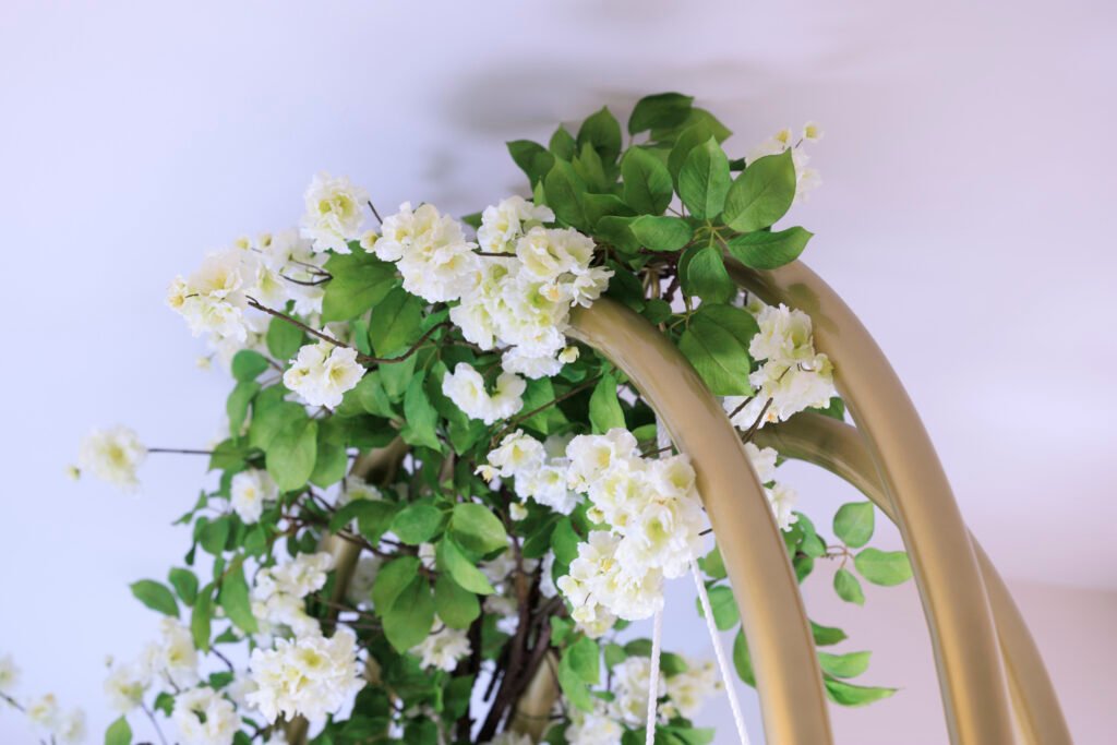
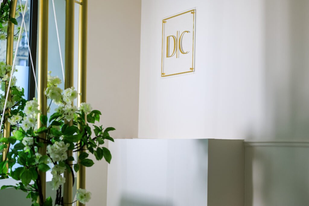
Due to my background as a content creator for platforms such as Instagram (now for over 6 years!), a social media spot for taking photos could not be missing, of course! Completely in line with the clinic’s style and yet somewhat enchanting: a golden arch with flowers around it and a swing. The swing can certainly bear enough weight (maximum weight 125 kg) and you can gently sway on it. Don’t hesitate to swing on it and take a photo when you visit the clinic.

Now, I have often received the question from family members or other people who have already visited the clinic: Why would people take photos in an aesthetic clinic? Nobody wants to show that they undergo aesthetic procedures, right? Hmm… I understand this point, especially in a country like Belgium, where undergoing medical aesthetic procedures is still quite taboo, and you often face unwarranted judgment if you do. Many people still keep their aesthetic procedures a secret from their friends, family, and even partners, out of fear of negative reactions, let alone posting a photo in a clinic.
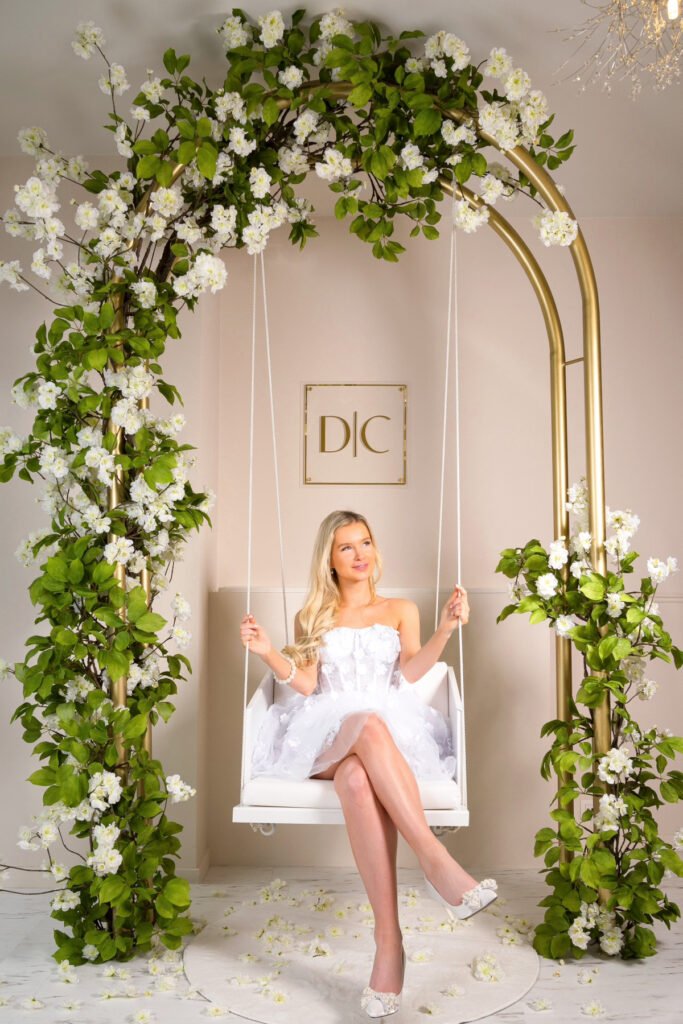
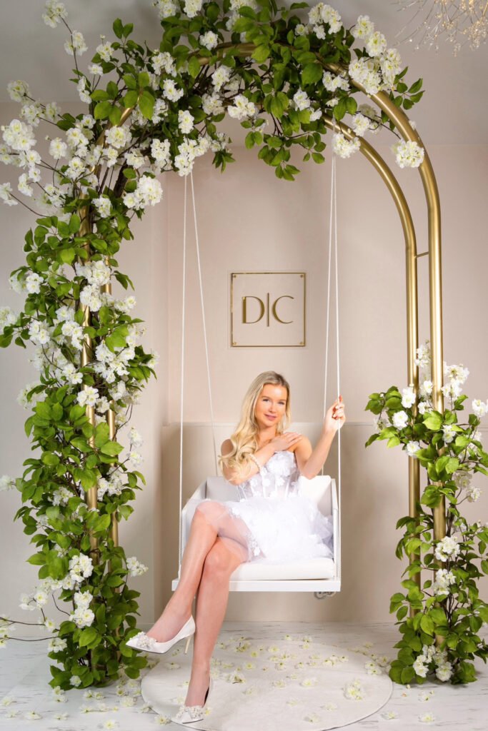
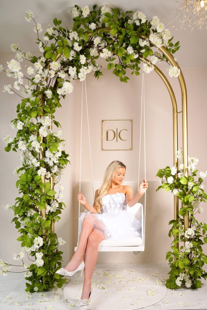
However, I do believe that this is changing among younger generations, such as Gen Z (who might be less inclined towards anti-aging treatments but rather opt for beautifying treatments like lip fillers, chin fillers, fillers in the cheekbones, etc.), where these treatments are becoming less taboo. Let’s also not forget that not all procedures I offer “change” your face… There’s nothing wrong with getting a skin booster for your skin to improve its condition… 😉 This can start as early as your twenties and continue into your sixties. After all, don’t you also apply your daily moisturizer?

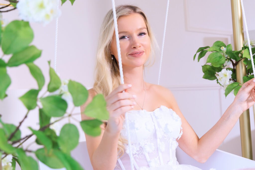
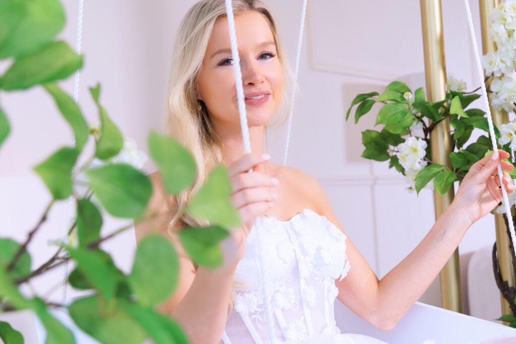

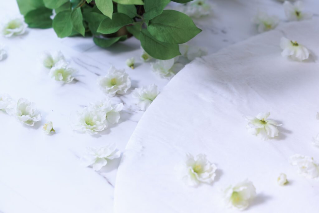
Je bent altijd welkom om samen met een vriendin te komen om een foto te maken of stuur gerust een berichtje op Instagram, zelfs als je niet van plan bent een behandeling te nemen maar wel een foto wilt in de schommel. Wel enkel op afspraak!
4. Hallway
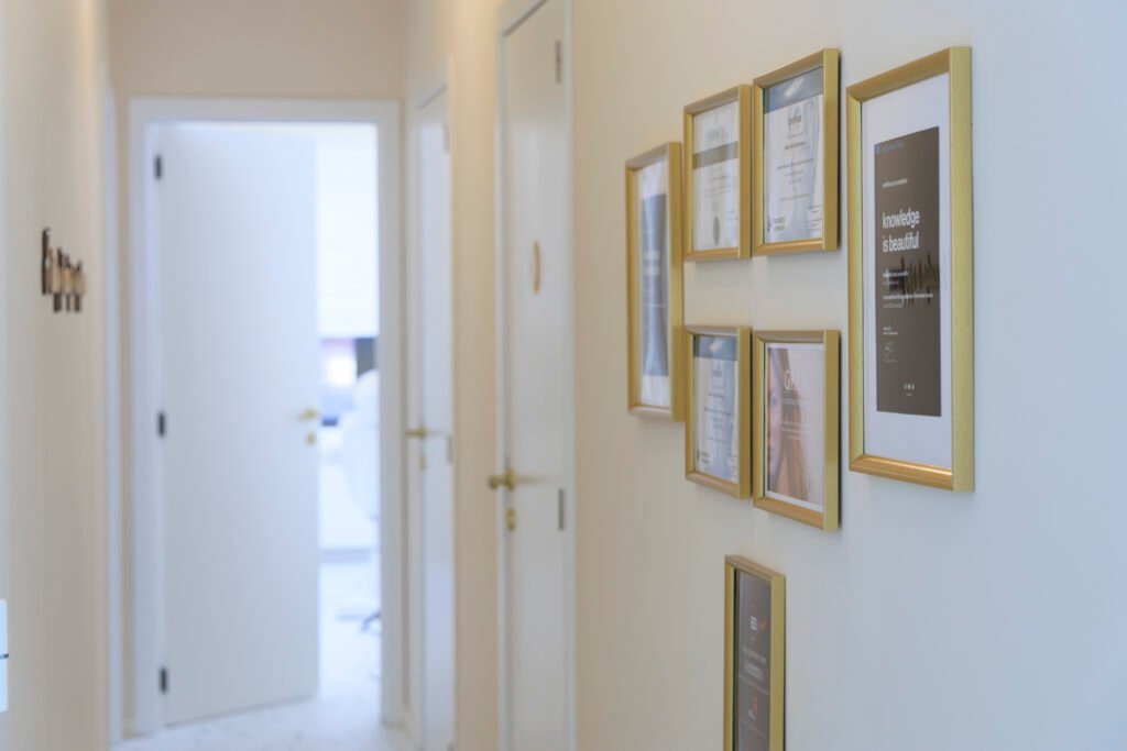
The hallway… Perhaps discussing a passageway doesn’t seem very exciting, but I believe that all spaces through which patients walk should receive attention to be well-decorated with nice details.

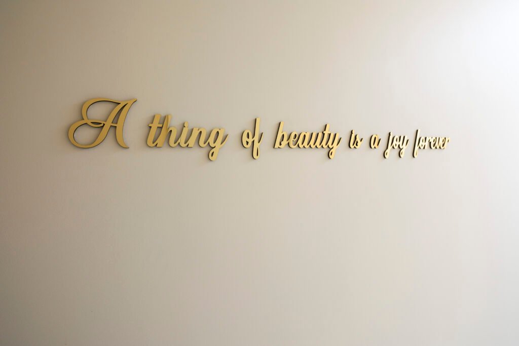
Beauty always brings joy, and at Doctor Contour Clinic, we aim to make this joy sustainable for everyone, regardless of age. Our mission is to support and enhance natural beauty, so that everyone can feel good.

As in any medical practice, certificates of completed training in aesthetic medicine are of course essential! As a physician, Dr. Kim Detollenaere, I have attended as many training courses as possible before the opening of my own clinic, and on this wall, you can admire some of these certificates.
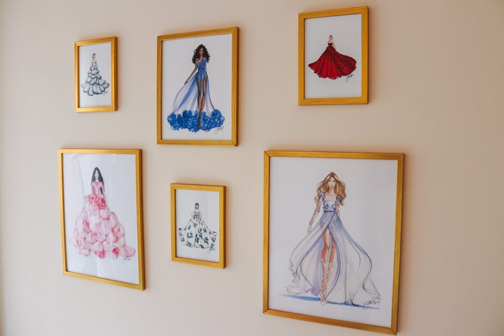
Finally, I wanted to add an extra personal touch: fashion sketches. If you’ve been following me for a while, you’ll know that before I wanted to become a doctor, I always said I wanted to be a fashion designer, specifically specializing in long evening gowns. Those who have been following me on my personal ‘fashion’ Instagram for a while will know that I have a fondness for long, beautiful evening gowns. I’m personally very excited about these sketches, where each long gown is inspired by a flower or incorporates elements of a flower, perfectly integrating with the theme of my clinic.
5. The Restroom
Even the decoration of the smallest room was considered! Initially, the restroom was a very empty space, without even a toilet paper holder… All sanitary facilities and details were replaced with ones in the color gold to align with the ‘Doctor Contour’ brand.
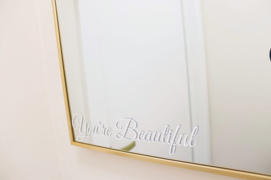
On the golden mirror, the text “You’re beautiful” is displayed because I want patients to feel beautiful and leave with a positive experience from the clinic through small elements like this.

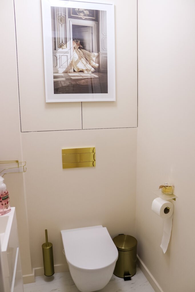
The poster hung above the toilet perfectly complements the rest of the clinic with its beige undertones, moldings, and exudes a blend of elegance, class, mystery, and femininity overall.
Oh, and let’s not forget the Chloé perfume on the toilet paper holder (maybe a tad too much for a bathroom, but I love it!).
Conclusie
The process of brainstorming, planning, organizing the entire execution, and finishing the details and decorations took me several months of hard work. It has taught me a lot but was also challenging and demanding. I am pleased that the foundation of Doctor Contour Clinic is now in place, and the whole adventure can begin! In summary, you could call the theme of the clinic’s interior “The Golden Flower.”
If you are interested in a consultation and/or treatment, you can book them at Doctor Contour Clinic for all your medical aesthetic treatments via the clinic’s website.
Be sure to keep an eye on our social media channels, as we are currently working on an event for the “Grand Opening.” However, please note that you can already book a consultation and treatment now, even for dates before this “Grand Opening” event!

